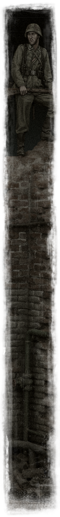


Young Miniatures - SS-Fallschirmjäger Battalion 500, Drvar 1944
_
And finally here's an update from the workbench. As previously mentioned, my hectic teaching schedules have prevented me from sustaining any intensive projects in the past month. So struck by the mood for a quick and relaxing painting project, I decided to have a shot at painting this lovely sculpt by fellow French colleague Laurent Borget through the generous courtesy of Young Bok of Young Miniatures.

The kit consists of six parts(including the plinth). With minimal flash present, painting began almost immediately after the resin carriers were removed. No assemblies were needed on the onset. These were separately painted in their respective local colors over my customary black undercoat.
Feeling tired with my current palette of colors which essentially revolves in the recreation of the subjects' actual colors, I decided to draw some inspiration from the Impressionist artists such as Corot, Cezanne, Monet and Renoir in their approach to painting.
More often so we attain tonal contrast by introducing either a darker shade or lighter tone of the local color as highlights or shadows. Sometimes black or white is incorporated to achieve that particular tint or shade. There is absolutely nothing wrong with that approach and as a matter of fact, that was the common practice in many schools of painting before the Impressionist movement began. The Impressionists rather, abstained from the use of black in their palettes and leveraged on complimentary colors for shade and contrast. Quoting from Renoir "No shadow is black. It always has a color. Nature knows only colors … white and black are not colors."
Drawing references from the Impressionists, I embarked to explore their theoretical use of complimentary colors in creating shadow tones in lieu of black. The problem however for the uninitiated would be the means to define the complimentary colors of the local colors on the figure; taking for example what would be the complimentary color of flesh tone?
As all colors originate from the primary of Red, Blue and Yellow, we begin the analysis by determining the color bias of the flesh tone. Bias meaning, does it slant towards orange, yellow or red/pink, etc...? Determining the color's bias can subsequently allow one to associate it with its complimentary color. Meaning to say that should the flesh tone be of orange bias, its complimentary will be blue, yellow bias will be violet and red/pink bias will be green.
There are two key approaches in the employment of complimentary colors. The first would be by mixing colors with their complimentary. Doing so in small amounts will dull their intensity, creating a muted tone suited for that of a salty uniform. Too much however will result in a brownish mixture also known as "Mud".
The second deals fundamentally with contrast. Consequently, as colors affiliate, contrast is lost. That is where Monet picks up with the answer, "Color owes its brightness to force of contrast rather than to its inherent qualities […] primary colors look brightest when they are brought into contrast with their complementaries.”
Thus to achieve contrast in their works, the Impressionist favored multiple combinations of complimentary colors in their works. Examples include combinations of Red-Green, Violet-Yellow and Orange-Blue, resulting in a varied symphony of colors rather than a linear analogous range of colors.
As color is an immensely huge topic to cover, I highly recommend checking out the article Shading with Complimentary Colors by Einion Rees where he describes in greater detail about the theory and practice of color used by artists and their relevant application to modeling.


The painting gets more refined with the key features get accentuated. Mindful of the stark effect black produces, I prepared an alternative dark color for the outlining that consisted a mixture of Deep Prussian Blue, Flat Black and Purple.

For a more personalized touch, I proceeded to sculpt a scarf from epoxy putty around the collar of the Field Grey Tunic. Some leftover putty was used to model the strands of stray hair peeking out from his helmet; reinforcing his disheveled appearance. The scarf was painted red as a complimentary tone to the grey-green of the tunic.


cheers,
Calvin